okay. honestly? alabama plates kind of SLAY HARD. here's the 2022 one:
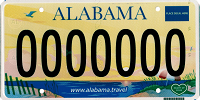
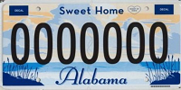
like look at this! a gorgeous beach at sunset (rise?) with rich colors that really work well together. really nice font choice for the state name too, AND the name's using that same lovely blue... honestly, with so many 2020s standard issue plates being lame as hell (looking at you, tennessee), this is super refreshing. AND alabama's been doing this for years! look at the 2009 and 2014 plates.
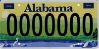
like. ugh. so pretty?!?! well, to be honest, personally for the 2014 one i think the colors are a liiittle off... the green's just a touch too vibrant and the blue's a bit too blue for it all to really mesh well. (the 2022 one gets this right!) BUT! i still have to give them props for what they were going for, the scene itself is lovely and i appreciate the font choice.
and the 2009 one is SO gorgeous, again, colors work wonderfully here, the way the scene sort of opens up is so fun. and the cursive font is so nice!
Not only are the standard issue plates so fun and whimsical. but alabama also has so many vanity plates... kind of an L for the don't tread on me plate, but forget about that for now - look at these cool fun ones instead!!
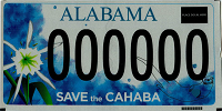
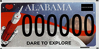
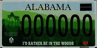
like, the cahaba one?! gorgeous. the SPACE ONE?? SO FUN??? honestly i think it might be my favorite one here. there should be more space-themed plates. and honestly the woods one... so real. like yeah man. i WOULD rather be in the woods.
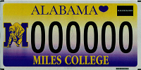
finally, these aren't quite as fun, but alabama has a ton of plates for various schools - i'm a big fan of the miles college one.
hell yeah brother... alabama nonbinary pride plate. anyways!
- + consistently pretty, well-designed standard issue plates
- + wide variety of vanity plates with unique designs
- + fucking SPACE PLATE!!!
alaska doesn't have the widest variety of options, but the ones they do have are pretty good! the standard gold is a little boring, with just a flat gold back and blue flag on it...
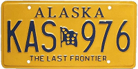
but! well, the font is nice, and the solid gold + blue makes it pretty recognizeable even at a distance. nice! however...
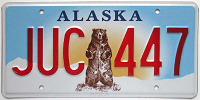
it has NOTHINGGG on the grizzly bear plate. hoooly shit dude. LOOK AT THIS...! honestly probably one of the best plates out there. fucking grizzly bear man!! PLUS the gorgeous colors... the blue, yellow, brown, and BRIGHT RED LETTERS (WIN) work so well together. and it's SUPER recognizable!! honestly. alaska bear plate sweep.
finally: look at the artistic plate!!

gwwuhhh look at it?! the aurora?! the solid white moon rising over the mountains?! the trees in the foreground?! wonderful. wondaful. overall:
- + bear VERY recognizable, regular still fairly recognizeable
- + bear plate fucks hard
- - standard issue not bad, but a little boring
- - fewer options
been the same since 1997... they knew what they had was good. respect
- + classic design that fits the state AND is unique AND looks good
- + wide variety of uniquely-designed specialty plates
- + BINARY PLATE!!!!!!!!!!
- + honestly something for everyone. there's one with a plane on it
honestly... not a ton to say about arkansas...
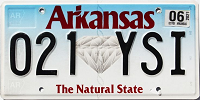
honestly just kinda boring. not really super recognizable, red doesn't go the best with the blue...i like what they did with the font at least. honestly it was better when it used to be white with red digits and blue text. oh well.
- + wildlife plates. i guess
- + not BAD really...?
- - pretty lackluster
- - mostly boring speciality plates
the thing about california is like... ok. is the standard issue plate NICE?
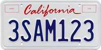
Like, sure, yeah, it's nice. It's classic! it's the lovely red cursive on a nice plain white. it's nice I guess. And I admire the commitment I guess, it's been that for several decades.
but like... my god. it's BORING!!! No slogan. No design whatsoever. Not even a state outline or anything. Holy shit!!
and like OKAY YEAH SURE. pricing and whatever. it's probably cheaper. but to reiterate I DON'T CARE. WHERE'S THE FUN AND WHIMSY!! like. HOLY SHIT look at the 1982 CALIFORNIA PLATE!!!
it was SO BRIEF of a design but SOOO GOOD. the rising sun, the gold-red-blue combo, the fun font for "california," the state slogan...! it's very simple but it's a GOOD very simple!! with just a couple alternating gold-and-white lines it evokes the sun rising over the sea, like... man! i know most of my favorites are more complex, but look how good simple designs can be!!! every day i miss the 1982 california plate.
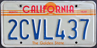
alright. so. standard issue plate: boring as fuck. and honestly? there's not a lot of specialty plates, and a lot of the ones that are there are... kinda boring. BUT! there ARE SOME FUN ONES!!! check these fuckin out man:
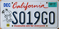
like ok sure the museums one is. you know. boring. but HOLY SHIIIT SNOOPY LETS FUCKING GOOO
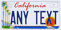
also LOOK AT THE ARTS PLATE!!! honestly that would make suuuch a gorgeous standard issue plate. the blue text, the sun over the ocean - the composition, with the palm trees off to the side!! - the COLORS!! they all work so well together, the blue shading on the palm trees, the yellows and reds... ughhh it's so good.
and and!! look at these too!!
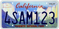
the, ah. the red's actually a little hard on the eyes on the yosemite plate LOL. BUT the background design is gorgeous!! with the sweeping blue sky and the pastel cliffs... ahh lovely.
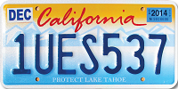
and the tahoe one - well, it's not as nice in comparison to the yosemite and arts plates - but, it's still nice, and better than the plain standard issue one! the red works well on the orange here, and orange + blue is such a good combo in general...
so! overall. california: do better. i know you can.
- + admire the commitment to the font. plus the red cursive is just nice anyways
- + few specialty designs are quite nice
- + Snoopy plate
- - 1982 plate was WAY better i wish it were still the standard so bad
- - Its literally red text on white like they don't even have the state outline or anything
yea babey
- + very easily recognizable
- + CLASSIC design in use since 1960, RESPECT
- - BOOORING vanity plates SNOOOOREEEE
yea babey
- + blue-white gradient is nice. good font
- + fairly recognizeable at a distance
- - a little lackluster
- - NO fun specialty designs
LOOK AT THIS GUY!!! OBSESSED!!!
- + classic blue-and-yellow, respect to the commitment
- + the greener blue works better than oregon's pacific wonderland plate
- + apparently there's some like delaware license plate culture?! obsessed tbh
- + the fucking lighthouse plate's state outline for the L in delaware. LOVE.
- - standard issue is BORING frankly
- - several specialty plates are admittedly boring
yea babey
- + nailed that shit in like 1998 and rolled with it, and for GOOD - IT'S GOOD DESIGN!!!
- + like literally the colors, the green orange white combo, the orange and the blossoms... wonderful
- + a lot of gorgeous and some really FUNNY plates
- - quite a lot of boring ones though
yea babey
- + GORGEOUS standard issue plates with lovely peach themes and wonderful details
- + like literally the colors, the green orange white combo, the orange and the blossoms... wonderful
- + a lot of gorgeous and some really FUNNY plates
- - boring specialty plates :(